Garbanzo Rebrand
Brand Identity
Garbanzo Group LLC
We’re thrilled to introduce you to the evolution of our brand. We’ve grown and matured over the years, and we felt it was the perfect time to reflect those changes externally. Our rebrand isn’t just cosmetic; it’s a renewed commitment to our mission, values, and the amazing people we serve – you.
Updated Brand Identity
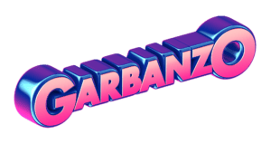
Same Garbanzo with a new Fresh Look

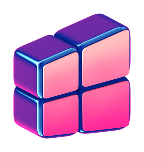
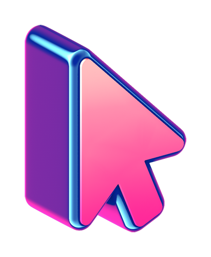
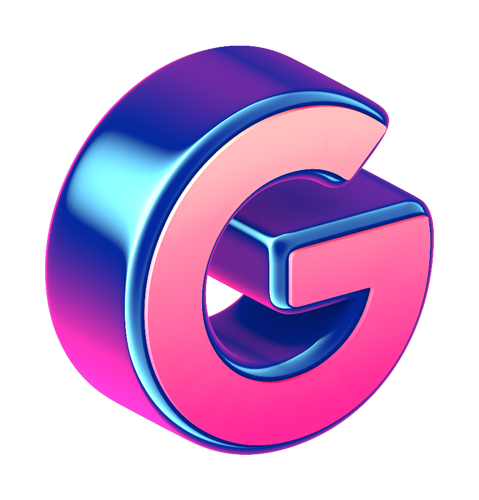
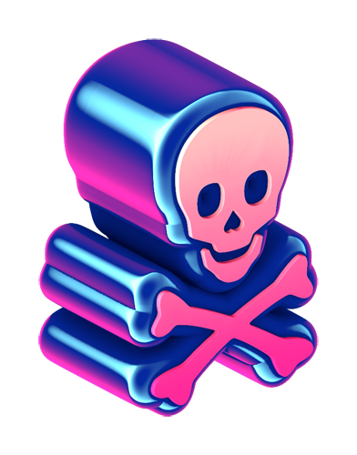
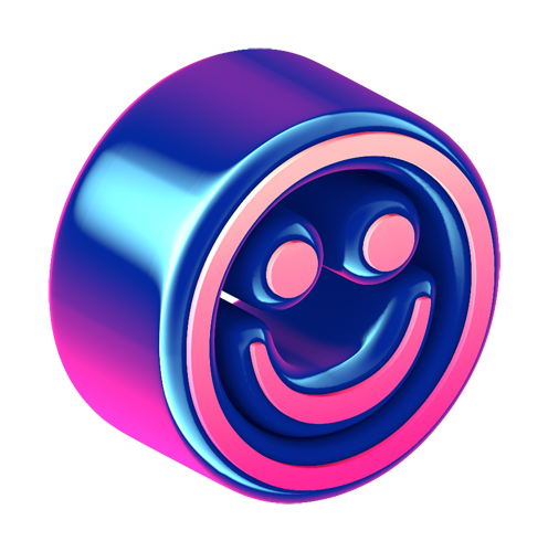
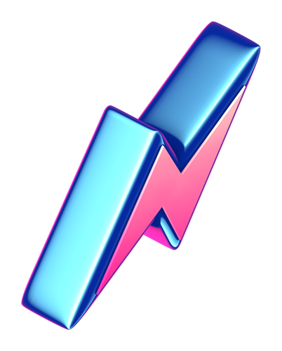
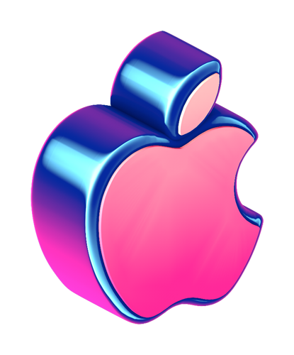
The new logo and icon were designed to be playful and fun, evoking comic book design and colors. Contrasting this is an infographic isometric design, evoking technical precision.
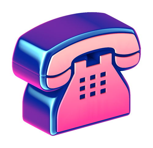
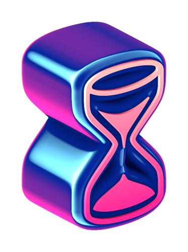
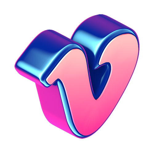
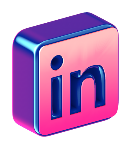
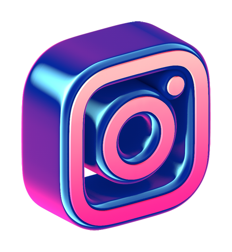
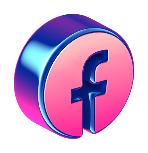
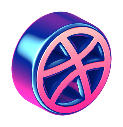
After developing the logo, we decided to explore with different fonts and icons, ultimately coming up with the official Garbanzo Icon set. This fun icon set includes some of the most popular social media icons as well as some standard emojis and other iconography from the last 10 years.
After developing the main logo and icon, we decided to explore with different fonts and secondary icons, ultimately coming up with the official Garbanzo Icon set. This fun icon set includes some of the most popular social media icons as well as some standard emojis and other iconography from the last 10 years. Get your free Garbanzo Icon Pack here!


Compared to the old logo, the new one has several things different while still maintaining the essence of the old brand.
- The new logo is roughly at the same angle as the old one. This helps with recognition so our clients who know us as the old brand will recognize us immediately.
- The font is also almost the same settling on a slightly different weight.
- Although we maintained a few of the old colors in general, the color palette is very different.
- One aspect we thought would help refine the old logo is to use a parallel camera to give it an isometric look. It also helps with readability
- We wanted to give the logo a softer feel to make it more approachable so we rounded the edges.
- Speaking of edges, the bevel profile has been improved to make it easier to distinguish the two different aspects of the logo. The front face and the back bubble.
The result is a candy coated logo that makes your mouth water.
The animation was a challenge because we wanted a bouncy look, similar to the old animation, but with a modern twist. We experimented with avariety of different animation types, some of which you might see in the coming months. Keep an eye out on social media. 👀
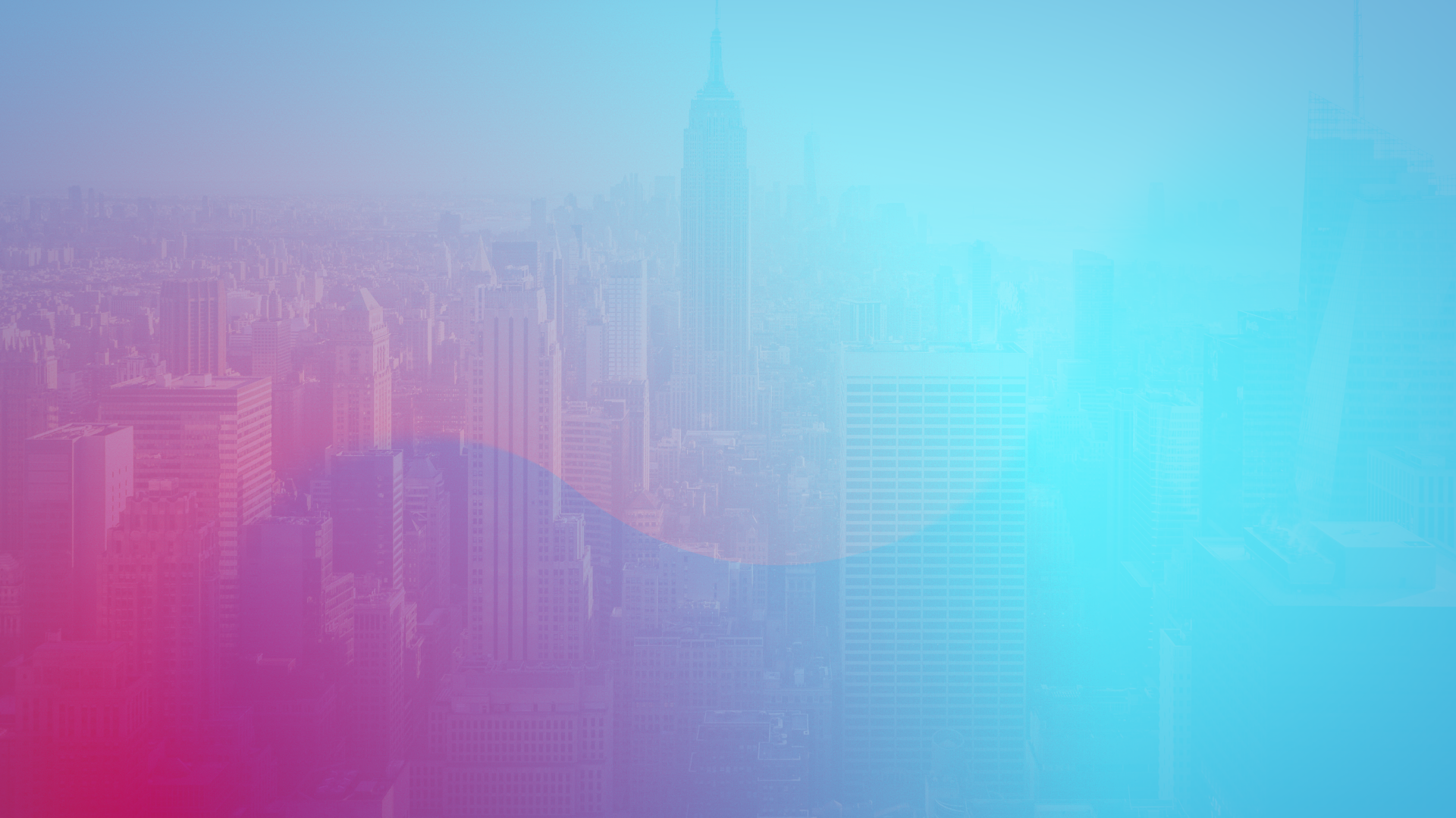
We love gradients. That goes without saying because gradients are awesome. While working on the new brand we tried to think about different ways we can explore gradient backgrounds that would both look good, and also be different from the standard linear or radial gradient.
We came up with this solution using variable feathering in masks in Adobe After Effects. The result is a subtle shape pattern that complements the foreground elements but doesn’t compete with the main message. (They also make great desktop backgrounds!)
THE LONG SHADOW
Obviously, there are more than just 3D elements in our branding. For headlines and other important text, we created our version of the Long-Shadow. Speaking of long shadow…
Custom Website Design
Garbanzo webception
Look familiar?
No this isn’t an Xzibit’s “Pimp My Ride” meme, or a B-plot in the Inception movie. We put our website inside our website…because we love building websites!
We’re proud of how our website turned out. Web design and development are intrinsically linked, so both teams need to work together efficiently. Each section and element presented itself with it’s own unique challenges that we enjoyed solving.
#crushedit


We know mobile dev.
We live in a time where almost everything can be done from a phone. As such advertisers, like Google, recommend building your site for mobile-first.
At Garbanzo, we pride ourselves on being up to speed on the latest design trends and techniques. Based on those trends we built our own website with a more comfortable navigation system that lives in the bottom of the screen.
Check out that footer nav menu!
social media? yes please!
Our social media game has been officially been upped. We took our media expertise and designed graphics for our Instagram feed that would be fun!
Other Brand Details
Fonts and colors
font 1
barlow condensed 52 px
barlow condensed 40 px
font 2
quicksand 700 52 px
quicksand 700 40 px
quicksand 700 20 px
quicksand normal 16 px
Main colors
#12184A
#153CBD
#00A6FF
#84F5FF
#FC0141
#FF1C73
#FD7DAE
#FDCBAC
Secondary colors
#FF9400
#F7DE00
#02800E
#00E700
#580098
#8404CF
#ffffff
#2D2D2D
#C0C0C0
#DEDEDE
#000000
see more projects

Art Basel Installation
Duis cursus nisl nec purus tristique, eu tincidunt justo hendrerit. Sed urna Read More

“John Leguizamo’s Road to Broadway”
Duis cursus nisl nec purus tristique, eu tincidunt justo hendrerit. Sed urna Read More

Mysteries at the Museum
Duis cursus nisl nec purus tristique, eu tincidunt justo hendrerit. Sed urna Read More

Arctic Rescue
Duis cursus nisl nec purus tristique, eu tincidunt justo hendrerit. Sed urna Read More

AI Processor Video for CES 2020
Duis cursus nisl nec purus tristique, eu tincidunt justo hendrerit. Sed urna Read More


