C&A Seneca Construction
Brand Identity
C&A Seneca Construction
Seneca Construction, based in NYC and the world leader in hospitality construction, reached out to Garbanzo in 2019 to refresh their brand. At almost 100 years old, Seneca has literally built hospitality in NYC.
Their iconic design is impossible to miss, so the rebrand needed to do the same.
Working with owner Carlo Seneca, Garbanzo created a 360° brand refresh that included an updated brand identity and system, marketing material, and print applications ranging from tshirts and hoodies to a fire engine red $200,000 Kenworth t880 dump truck.
Brand Refresh
Logo (3D Version)

Logo (2D Version)
Main colors
#000000
CRIMSON
#303030
FIRE
#8A8A8A
SALMON
Secondary colors
#000000
#303030
SLATE
#8A8A8A
CONCRETE
#BFBCBD
ALUMINUM
#FFFFFF
Print Collateral
The Ferrari of dump trucks
Apparel
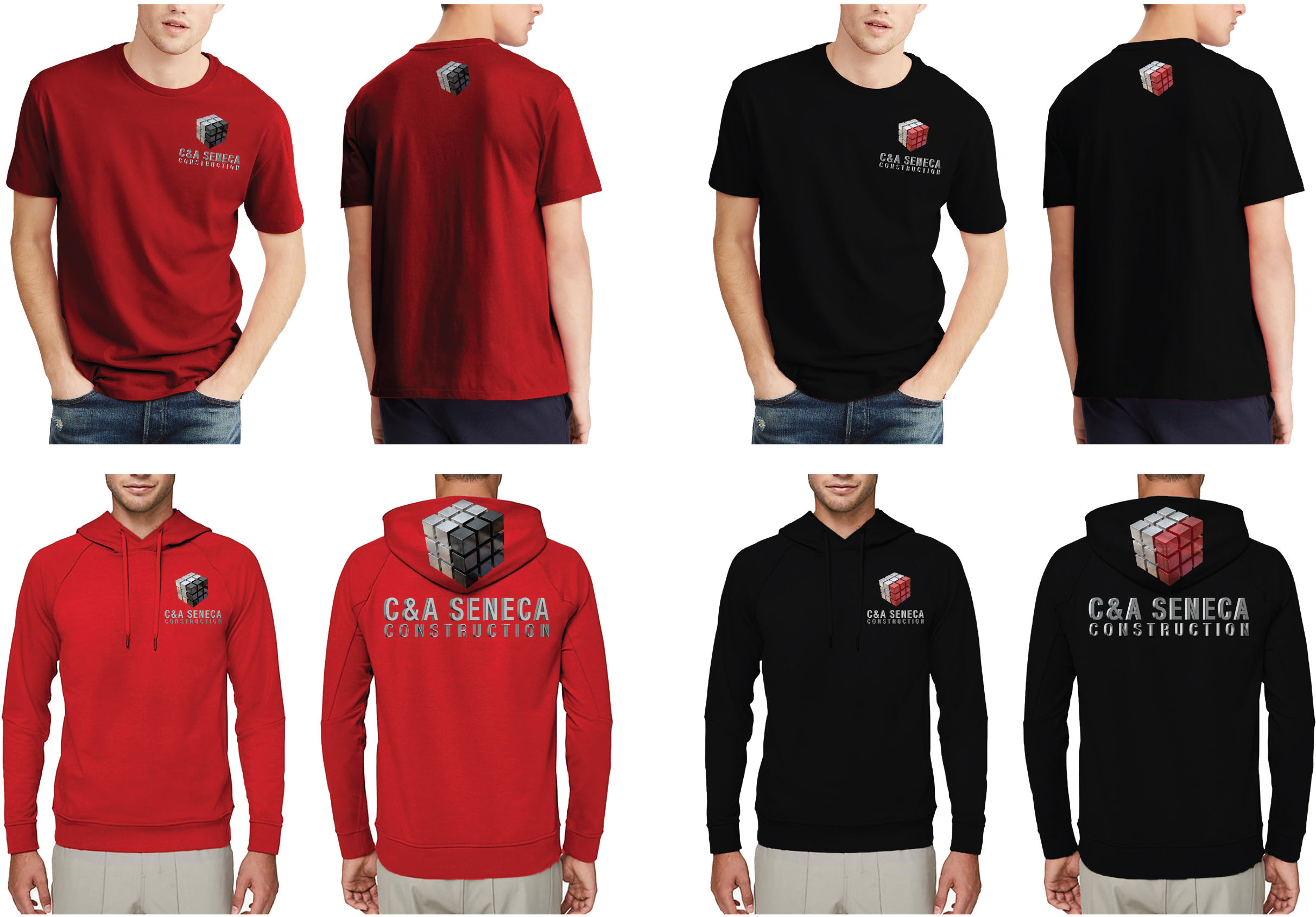
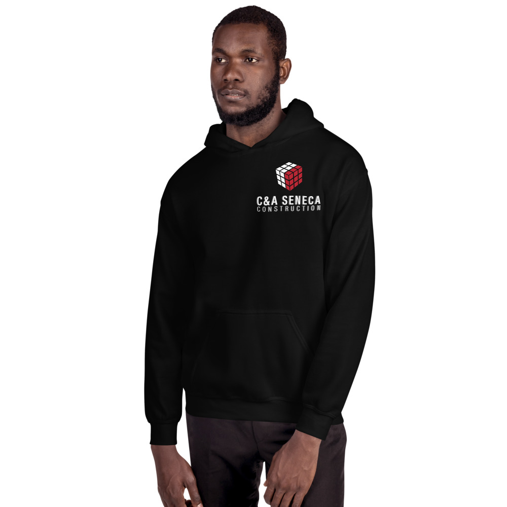
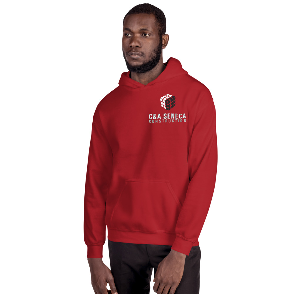
Apparel
While T-shirts were a standard design, the hoodies were extremely challenging: printing a huge vector image was nearly impossible. Luckily our print facility was able to pull it off. What do you think?
Web Design & Development
site launch: march 20, 2020
DESKTOP:
Mobile:


A friendly mobile experience
We live in a time where almost everything can be done from a phone. As such advertisers, like Google, recommend building your site for mobile-first.
At Garbanzo, we pride ourselves on being up to speed on the latest design trends and techniques. Based on those trends we built our own website with a more comfortable navigation system that lives in the bottom of the screen.
see more projects

Programmatic Weather Animations
Duis cursus nisl nec purus tristique, eu tincidunt justo hendrerit. Sed urna Read More
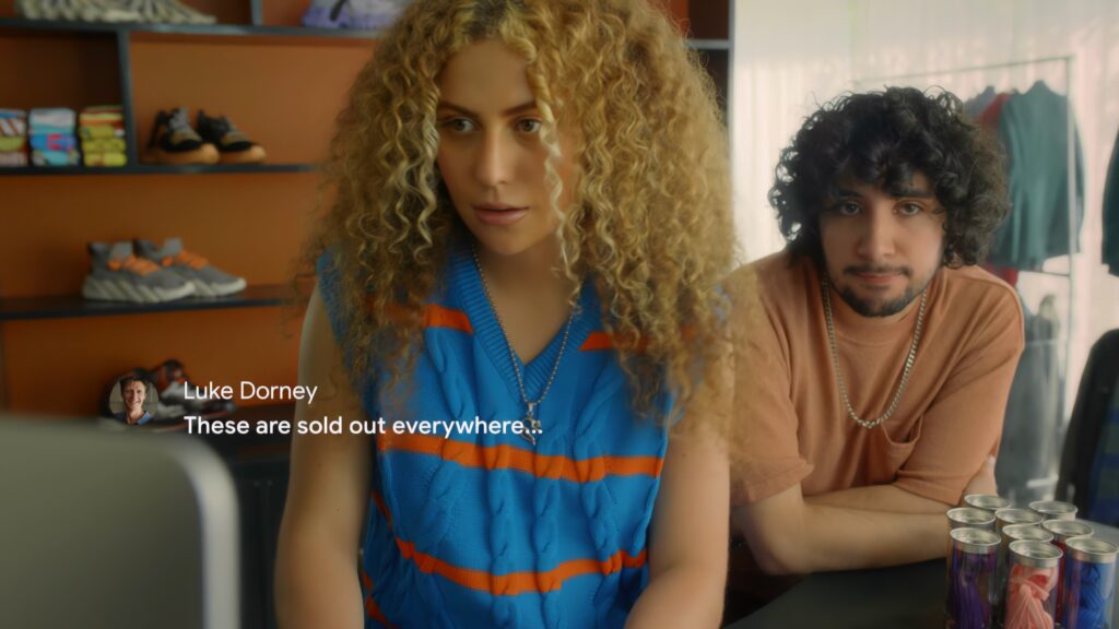
Google Workspace Commercials
“Mini Monster” :30 and :15 Spot “Last Pair” :30 and :15 Spot Read More

UNIQLO “Wonderqube”
Duis cursus nisl nec purus tristique, eu tincidunt justo hendrerit. Sed urna Read More
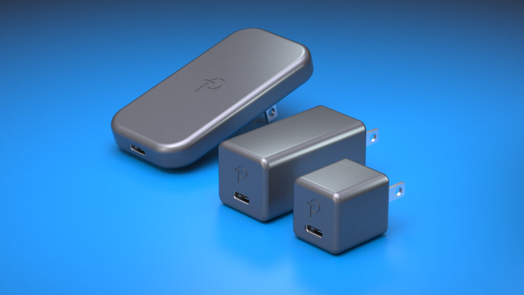
Product Renders for Charging Adapters
Print Design CGI Imagery We also provided Power with high resolution 3D Read More

Mysteries at the Museum
Duis cursus nisl nec purus tristique, eu tincidunt justo hendrerit. Sed urna Read More


